It's time to talk about Dark Patterns.
TikTok, Fortnight, Facebook - they all got slammed for dark patterns.
The EDPB (European Data Protection Board) has issued guidelines that revolved around dark patters such as how they affect Cookie Banners and how to recognise and avoid dark patterns in social media platforms.
To say the least - dark patterns are, and will, be on the forefront of privacy and data protection minds. It will also influence fines and penalties.
Marketers use dark patterns without thinking twice. Callingl it "marketing psychology" or "cognitive biases".
Let's dive into some of the more common ones and how we can adjust for them to be more compliant when it comes to privacy and, ultimately, respect our users decision about what to do with the personal data.
What are Dark Patterns:
According to Harry Brignull, the designer who coined the term, dark patters are “tricks used in websites and apps that make you do things that you didn't mean to, like buying or signing up for something.”
Relating to privacy specifically they are deceptive design practices used by websites and apps to collect more personal or sensitive data from you.
Marketing and Dark Patterns
Marketers use dark patters to get people to:
Opt in to emails and messages
Give uniformed consent
Take risky decisions in regards to their privacy
Share more data, or buy more, than they intended
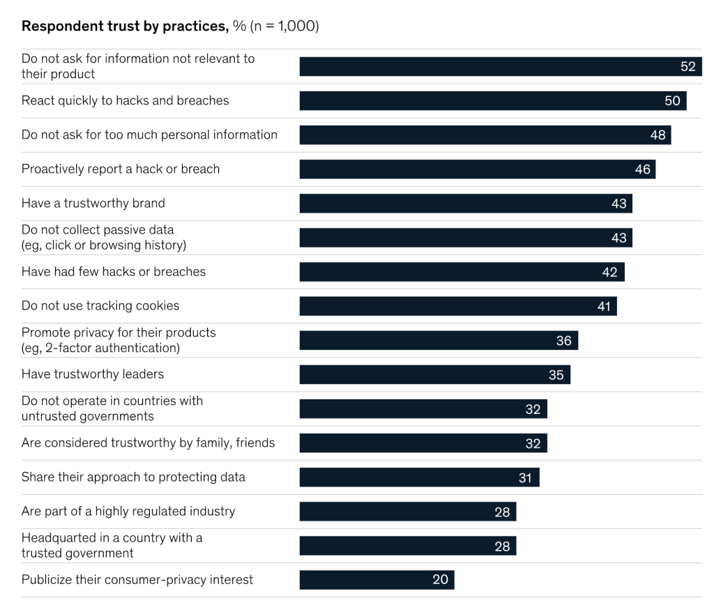
A recent McKinsey study in North American showed that people prefer companies that limit their use of personal data. Even more of a reason to consider being open and transparent about what you are doing instead of tricking the user with deceptive design.
So what can marketers do instead:
Use language that is easy for consumers to read and understand.
Avoid friction when consumers cancel, unsubscribe or refuse to subscribe.
Explain consequences in a neutral way.
Offer balances and symmetric choice.
Don't use pre-selected check boxes to get consent.
Avoid manipulative interface and language that might steer consumers in a certain way.
Make sure privacy notices, T& C's, etc are easy to find and disclosed at the appropriate point within the users journey.
Use design to enable user to make an informed choice.
Allow for users to have a privacy first experience on a given website or app.
Include a privacy expert within your design process.
Top Types Dark Patterns
Confirmshaming
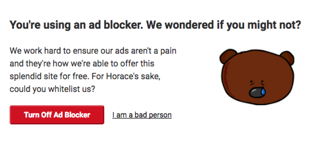
This dark pattern is simple. You are guilting a user into something they don't necessarily intent to do.
It's a classic used to get people to give you an email in exchange for a discount. It's everywhere.
The "No, I don't want a discount" link we need to click on.
Or this:
What to do instead?
We can offer a clear and informed choice. Let the user determine what they want.
Ways to do this is to:
Inform the user as to what you are collecting and why to help make an informed decision.
Use symmetric design and wording such as "Yes" and "No" instead of "Yes" and "No, I don't want to save money".
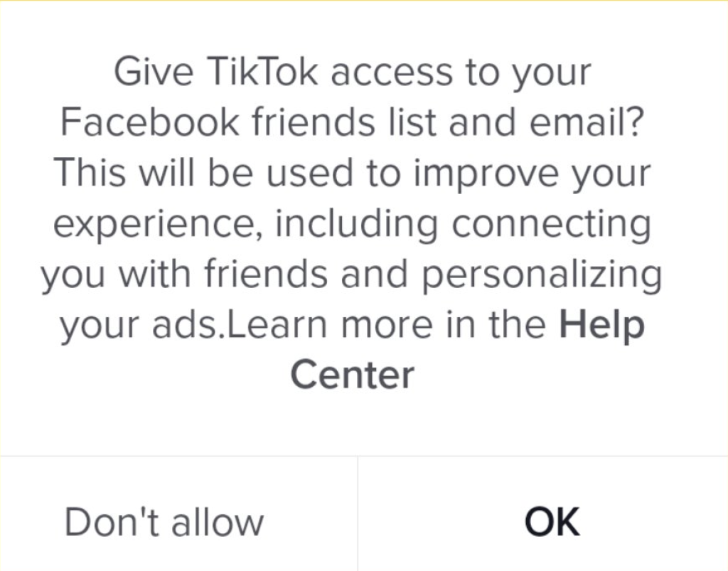
Misdirection
Misdirection is using confusing wording or making one choice more prominent than the other.
Such as TikTok.
They want:
Access to your friends lists
Your email
Show personalised ads
Confusing for sure - there is just way to much going on. And then you only have two choices: a clearly preferred "OK" and then the greyed out "Don't Allow"
What to do instead?
Only ask for the data you actually need. Not more.
Let the user know why you need the data and what you will do with it.
Only ask for one thing at a time or give the user a choice as to which elements they want to opt in and out of.
Make your options balanced (as mentioned above).
Roach motel design
The roach motel design is just like a roach - easy to get, hard to get rid of. It's providing an easy path to get in but a difficult path to get out, such as when it’s easy to sign up to a subscription but much less easy to cancel.
For example when you are trying to cancel a software trial:
First you click on Cancel Trial (usually greyed out or hard to find).
After finding, and clicking on the button, you come to a new page with the option to Downgrade with a list of features you might loose. Time to find the Cancel button again - usually hidden and tiny somewhere on the bottom of the page.
Wait, Why you want to downgrade? (It's all in the name of user research) Give them a reason and get ready to be asked - again - if you don't want to stay on. They will provide a Major Discount.
Find the Continue to Cancel button again.
Finally.
You've made it.
You've cancelled your free trial.
Now imagine that flow when a user wants to withdraw consent for tracking.
What to do instead?
It's simple. Make it as easy to opt out, cancel, unsubscribe, as it was to get onboard.
Show a clear unsubscribe button and honour it.
Allow users to cancel easily without making them jump through hoops.
Let them opt-out with one click and without consequences.
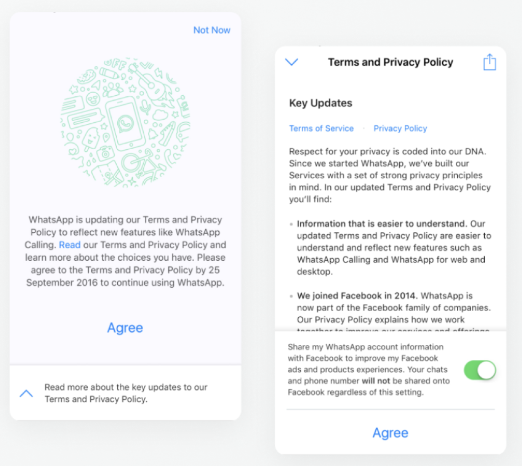
Privacy Zuckering
Named after Facebook CEO Mark Zuckerberg, this dark pattern tricks users into sharing more information than they intend to. It's used a lot when agreeing to new terms and conditions, such as the WhatsApp example below.
What do to instead?
Be clear about changes up front.
Don't pre-tick boxes that are accepting something the user might not understand.
Use simple language when communicating any changes.
Highlight changes in the privacy policy or T&Cs that have changed since the last time for the user to easily understand.
Consider offering the conditions in other languages for ease of understanding.
These are by no means all the dark patters there are but hopefully this shows you how to think about alternative ways to market all while respecting your user.